Skip to main content
Search
Find a Pro
Login
Our Purpose
Who We Are
About Interior Design
Our Board
Contact Us
Meet Our Pros
Directory
Report Misuse
Interior Designer Defined
Standards & Enforcement
File A Complaint
Report An Illegal Interior Designer
Become an Interior Designer
Credentials Matter
Pathway to Interior Design
Join ARIDO
Reinstatement of Membership
ROI
About ROI
Past ROI Initiatives
Sponsorship Opportunity
Application
Events
Community Events
2026 ARIDO Awards Gala
2025 ARIDO Awards Gala
2024 ARIDO Awards Gala
ARIDO Townhall and AGM 2026 recap
Ontario Summit and ARIDO AGM 2025 Recap
Ontario Summit & ARIDO AGM ’24 Recap
2026 IDS Toronto Recap
Recap: ARIDO at the Interior Design Show 2025
Industry Opportunities
Event Space Rental
Interior Design Month
Awards
2026 ARIDO Awards Gala
2025 ARIDO Award Winners
2024 ARIDO Awards Winners
Past ARIDO Award Winners
Fellow and Honorary Members
Student Scholarships
Resources
FAQ
RIDA FAQ
News
By-Laws
Partnerships
Equity, Diversity, & Accessibility
CEU Opportunities
Job Opportunities
Submit Your Job Post
Virtual Suggestion Box
For Members
Membership Gateway
ARIDOAccess
Professional Development
Submit Your Job Post
Student Opportunities
Insurance Options
Blog
Login
Search
This field is required
All
Blog
News
30 Dec 2024
ARIDO Award: Misoya Ramen Shop
27 Dec 2024
ARIDO Award: Indigo, The Well
23 Dec 2024
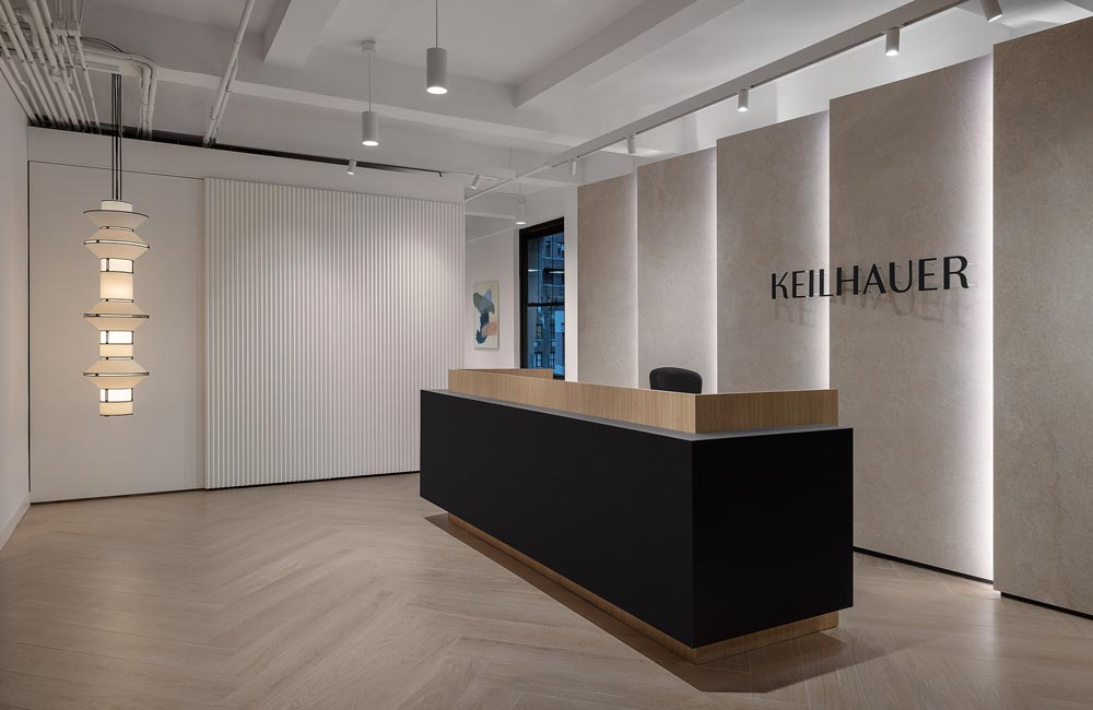
ARIDO Award: Keilhauer NYC Showroom
18 Dec 2024
ARIDO Award: FH Farmhouse
17 Oct 2024
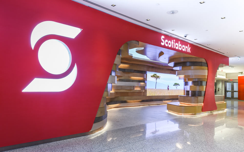
ARIDO Award: Scotiabank North Concourse Lounge
21 Mar 2023
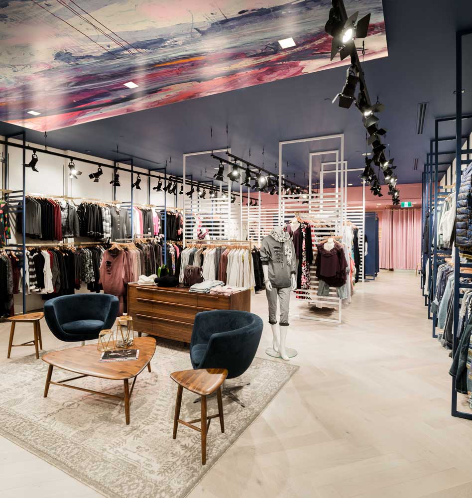
This beautifully redesigned retail space puts fashion forward
14 Nov 2022
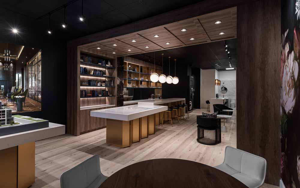
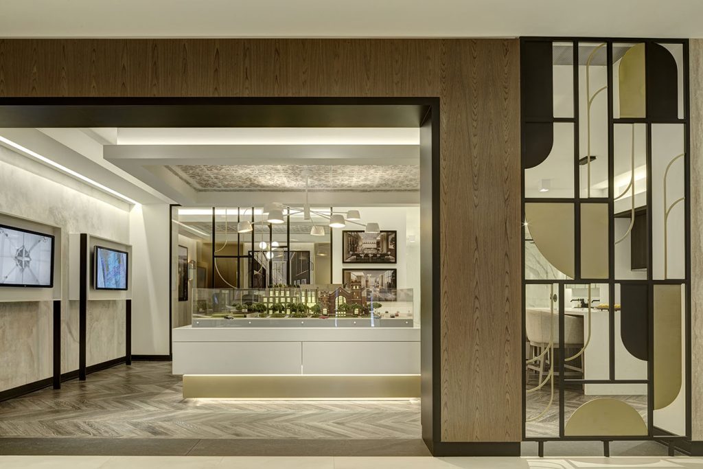
ARIDO Award: Trailside Presentation Centre
15 Aug 2022
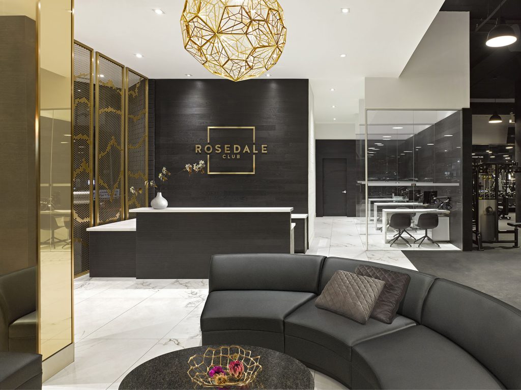
This interior brings all business operations together so naturally
21 Mar 2022
A journey through eclectic luxury in this condo presentation centre
7 Mar 2022
Opening a new chapter in retail design
4 Feb 2022
Luxury lives in this high-end condo presentation center
21 Jan 2022
An exercise in elegance and luxury