History and place dictated the eclectic redesign of an East End icon

The new Broadview Hotel has come a long way from its former lives as a factory, a boarding house and then “Jilly’s” – an infamous seedy nightclub. Now, the landmark in Toronto’s east end is a chic 58-room boutique hotel boasting a restaurant, cafe, an indoor/outdoor event space, and a rooftop bar.

Interior Designer: Allen Chan, ARIDO
Design Firm: DesignAgency
Photographer: Worker Bee Supply

The building’s historic architecture, its varied uses over time, and the surrounding neighbourhood character inspired the design team to explore and reference its different phases and styles. They mixed styles and periods to reinforce the eclectic layers built up over time, using an array of bespoke finishes, furniture, and lighting, mixed with a pastiche of industrial, vintage and contemporary pieces. Furniture and lighting by Canadian designers including Coolican & Company, Anony, were incorporated along with custom art from a local curator.

Elegant bar area with stools and gray marble flooring.

A magnet for both guests and neighbours, the airy ground-floor cafe invites guests to sink into leather banquettes or gather at the white marble and brass bar under a halo of pink neon – an installation by the son of the creator of the original Jilly’s sign. Custom-designed wallpaper replicates designs found during demolition, and an “eroded” floor mixing wood and tile nod to the building’s history. The main-floor restaurant has the richness of a classic tavern, with surprising elements like drapery with lemurs smoking hookah pipes.

The guest rooms, the most spirited spaces of all, mix Victorian-style floral wallpaper and upholstery with deep blue ceilings, red velvet drapery, brass lighting, and even a brass rail to create a playful, modern boudoir ambience.

Bedroom at the Broadview Hotel with maroon curtains and lush white bedding.

The hotel’s treasure is found in the building’s tower, where guests find an intimate space for private dinners. The exposed brick and wood beams of the tower’s vaulted ceiling contrast with wood dining tables, leather chairs, vintage mirrors and a symphony of chandeliers – a magical space unlike any other in the city.

Interior dining room with decorative chandeliers.

The hotel has won numerous awards and the seventh-floor restaurant/bar has been voted one of the top patios in Canada, delighting guests with its stunning 360-degree views. With the redesign, the hotel is now a key catalyst in Toronto’s eastward expansion.

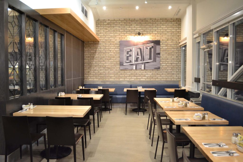
A restaurant refresh that brings generations together

Dundas Street Grille is an iconic Etobicoke spot frequented most commonly by the area’s baby boomers. The intention for this new design was to bridge the gap between generations and create a new and improved space for all. The client wanted to increase and optimize the bar and service area as well as introduce a dessert station in an already constricted space while maintaining seat count. Coupled with the challenge of introducing gray and blue tones to create a warm and inviting environment, the design team had our work cut out for us. 

Interior Designer: Vera Vujovic, ARIDO

Design Firm: Studio Bonton

The existing restaurant had a raised seating area at the back which was not utilized to the fullest and was isolated from the rest of the space. By dropping the height of this area, it opened up the space to foster a more versatile seating arrangement and a communal vibe. It now accommodates benches for large groups as well as booth seating for two, four and six. 

The existing service area corridor by the open kitchen has been widened -making it less of a squeeze for staff. A dessert display has been incorporated in the bar area which is unified by a sleek white quartz counter.  Poured epoxy on the floor is accented with charcoal hexagonal tiles that flow along the aisles, around and up the front of the bar. 

Solid maple planks add warmth throughout, from the ceilings to table tops, and the booth coverings in lime and blue add a playful and durable backdrop. 

In order to muffle the clatter and chatter of a restaurant, acoustical panels in light grey fabric have been added alongside the existing decorative tin tiles. This addition gives a dynamic aesthetic quality to an element which would be purely functional otherwise.

Any way you slice it, PZA Restaurant is a totally cool homage to Italy

PZA Restaurant is a distinctive, authentic Italian restaurant unique to the burgeoning culinary scene north of Toronto. The passionate first-time restaurant clients wanted their wholehearted Italian personalities to be reflected in the design. Known for their welcoming hospitality and traditional Italian menu, the PZA brand is unapologetically proud of its heritage which is celebrated in the food, art, and design of the space. 

Interior Designers: Keith Rushbrook, ARIDO; Dan Menchions, ARIDO

Design Firm: II BY IV DESIGN

Photographer: David Whittaker

With a total area of 4,200 square feet, our team provided a viable solution to the design, construction, operational efficiency, and overall space challenges. The design concept was inspired using food and pop culture to retell the story of traditional Italian values. We worked closely with the client to refine and elevate the original concept by creating a visually impactful space that celebrates Italian culture. 

Our design team worked to implement highly innovative customer experience strategies to improve the overall service. This included optimizing circulation spaces to maximize seating, and areas that blended beauty and functionality effortlessly into a carefully crafted ambience. The interior is a study of contrasts: original artwork and dark high-end design finishes with a confident composition of colour. 

Cool blues and bold reds were set against a slightly raw industrial background, while being accented by strategic lighting. An underlying foundation of the design was important in specifying the right products for an urban yet sensual feel. This was comparable to the restaurant’s attention to sourcing the best ingredients for its menu.

The humble restaurant proudly exhibits two incredible large-scale art installations: a wooden pizza peel ceiling sculpture, and an energetically bold graffiti mural. Both pieces embrace the essence of Italian culture, the love of food and life which epitomize the soul of the space. Turn your gaze up from any seat in the restaurant and you’ll see the 112-piece custom-designed paddle installation inspired by the lifecycle of a pizza peel. 

Unobstructed views of the 25-feet-long Sophia Loren graffiti mural by Anthony Ricciardi, a contemporary artist with an international profile, demonstrates the iconic Hollywood actress’s significance as a symbol of Italian food and culture. Sophia Loren symbolizes the passion, dedication, and tenderness in the social act of coming together to enjoy food.

Lower your gaze, and you will find a dining surface with #PZARESTAURANT engraved on each tabletop throughout the space, astutely tapping in to diner’s newly established instinct to snap a pic and post to the ‘gram before digging in. 

Through bold artistic gestures, earthy textures, rich warm shades and materials with tasteful Italian references, PZA maintains the signature relaxed but lively atmosphere that brings together all generations of family. 

The success of the project was found in the welcoming atmosphere and warmth felt in every corner of the restaurant. The essence of how food and life are meaningfully intertwined is what fuels the dynamism of the restaurant. In the famous words of Mrs. Loren, “Everything you see I owe to spaghetti.” Everything you see in the design of this magnetic space is owed to the passion and devotion for creating remarkable, lasting impressions.

PZA Restaurant was awarded an ARIDO Award of Merit in 2019

The materials palette is as lush as the menu at this Toronto restaurant

Our design team was contacted by David Chang, eight years after he launched Momofuku in Toronto. The brand has matured in new directions and experienced significant growth, so Chang called on DesignAgency to work with Momofuku once again to reinvent their signature Toronto restaurant. Kōjin, Momofuku’s take on a steakhouse, is all about treating guests to the sensations of an open flame grill. 

Interior Designer: Allen Chan, ARIDO 

Design Firm: DesignAgency 

Project Photographer: Bob Gundu

As the first Momofuku restaurant to be led by an Executive Chef instead of Chang,  the design needed to remain true to the brand while also conveying a slightly unique flavour – inspired by Chef Paula Navarette’s Colombian heritage.

Our design team began working with Momofuku’s core palette of wood and blackened steel, as well as its signature Token stools and Roll and Hill chandeliers. At the same time, we shifted the palette from white oak to dark walnut and added luxurious and sensual materials such as luminous hand-glazed terracotta tiles, oxblood leather, and touches of glittering brass. A Momofuku peach element at the entrance maintains consistency with other locations. 

The interior complements the restaurant’s Columbian influenced menu with an earthiness that further reflects the multicultural influences of the Momofuku brand. For example, the open layout was inspired by the buzz found in izakayas (informal Japanese pubs) that comes from an open kitchen, as well as the energy of parrillas (open flame grills from South America). Blackened steel shelves display tchotchkes against wood panels inspired by shou-sugi ban, the Japanese method of preserving wood with fire. This layering instills a sense of playfulness and curiosity.  

The client wanted a flexible main dining room, so we selected seating that can be easily repositioned or removed: stools for kitchen or bar-side dining, small tables, and large booths for groups. We also calibrated sight lines for high visibility, making it easy for staff to navigate the restaurant, while also ensuring that guests enjoy an intimate relationship with the goings on in the kitchen and bar. 

An open layout ensures that every diner has a view both inwards into the kitchen and open fire grill, and outwards with 180-degree views of Toronto’s University Avenue, taking advantage of Kōjin’s prime location.

Interior lighting consisted of carefully selected luminaires that inspired the mood and unique sense of place. Custom light fixtures float at the edge of the dining room, adding levity and announcing Kōjin from the street. Each pendant’s hand-folded triple linen shades are threaded like totem poles, softly illuminating the room at night.

Throughout the bar and the kitchen, backlit textured glass adds a warm glow against a black porcelain tile wall, and a red neon sign glows with the kanji symbol for fire.

The intrinsically unique Kōjin, offers a range of different environments – from grand to intimate. Our design team worked to create Kōjin as a completely new atmosphere for Momofuku Toronto. The range of textures and features bond together the past and present for an exclusive restaurant experience.

This project was awarded an ARIDO Award in 2019.

Whisky and whimsy reform luxury hospitality design

Situated in the former Trump Hotel in the heart of Toronto’s business district, the design team was tasked with removing associations with past ownership, while introducing Canadians to the historic St. Regis brand. Inspired by Toronto’s vibrant cultural heritage, the redesigned lobby, lounge, and restaurant express an enduring quality, setting a new standard for luxury hospitality in the dynamic city.  

Interior Designer(s): Allen Chan, ARIDO
Design Firm: DesignAgency
Photographer: Brandon Barre

Aligning the design with the elegant spirit of the St. Regis, we carefully selected materials in the lobby and Astor Lounge that exude artistry and craftsmanship featuring authentic woods, leather, and brass. An array of custom elements convey a sense of quiet excellence, while abstractly paying homage to a myriad of inspirations from the region’s geology, history, mapping, and urban architecture. The bronze fireplace in the lounge was inspired by the brick character of Queen Street West, while bespoke furniture pieces throughout echo the unique colours and textures of the Ontario landscape. 

The lobby and Astor Lounge are defined by a soft, earthy colour palette, customized furnishings and lighting, and authentic materials and textures which inspire a sense of calm by balancing the energy of the inherently urban location. A key challenge presented to the team was to establish a new environment while retaining character-defining elements like the floors and alabaster walls in the lobby, which were too valuable to remove. By adding elements that worked to shift emphasis away from the floor and walls we were able to redefine the space. A gilded topographical ceiling mural, oak reception cabinet, and an impressive totemic sculpture enhance vertical sightlines, prompt curiosity, and act to draw guests deeper into the hotel. 

The 31st-floor bar and restaurant are established as the jewel of the hotel, setting a tone of quality and luxury that draws guests to the restaurant as an inspiring new dining destination for the city. Prior to the redesign, the hotel restaurant was dark, intense, and dated. As a contemporary homage to historic precedents, the new signature restaurant feels transformed, elegant, and enduring.

Drawing inspiration from Canada’s history as manufacturers of distilled whisky and spirits, the design evokes the warm amber tones of whisky, and sparkle of refracted light through the cut crystal glass of a tumbler. The restaurant shimmers and glows as light bounces off the oak walls inlaid with golden beveled mirror detailing.

A 30-foot long marble bar, inspired by France and America’s grand hotel bars sets the stage for a dramatic yet intimate design, as sculpted bronze and smoked mirrored shelving displays backlit liquor bottles. Tailor-made furniture and fixtures such as soft leather stools, playful fringed lamps, bespoke billowing crystal chandeliers, and a custom ceiling mural in a whimsical combination of metallics and golds — the artist’s interpretation of whisky swirling in a tumbler — create a visually rich environment, bringing together culture, architecture, ecology and landscape in single space.

Elements of Chinese architectural history are key components of this restaurant’s design

Now opening its seventh location, Congee Queen wanted to incorporate elements of Chinese culture to reach out to new customers while maintaining their iconic brand for existing ones. The seating layout maximizes seating while providing a stunning visual experience from any angle of the restaurant. 

Interior Designer: Joe Cho, ARIDO 
Design Team: Long Wu, Derek Yeung
Design Firm: J.Cho Design
Project Photographer: AZ Photography 

Customers entering feel the vibe of a traditional Chinese restaurant but are greeted with a modern ceiling that emulates one of China’s most iconic and traditional buildings, the Temple of Heaven. Dissecting its architectural features, we were able to create key interior components that recall this important building and its architectural markers.  

Two columns were added to the layout, to balance two existing load-bearing columns and place greater emphasis on a centralized ceiling sculpture in the space. The columns are a visual cue that leads the eye to the massive sculpture composed of glowing curved elements. The design team tried several different configurations before finding the perfect angle for each suspended piece. An inky graphic of a dragon, an auspicious symbol of power, strength, and good luck in Chinese culture, done in a swirling indigo welcomes customers inside.  

The focus on traditional elements is emphasized with architectural details such as traditional Chinese rooftop edges on the ends of millwork dividers, and black lacquer and bronze accents found in traditional Chinese wooden doors at the host stand. The dragon visual element is recalled in the striated blue marble tables and continues around the surrounding walls, each element extending the customer’s impression of being amongst the clouds. 

A stunning mosaic is the crown jewel of this luxe eatery

Tucked between the side streets of Toronto’s chic and glamorous Yorkville, lies the fine dining restaurant Enigma.

The modest exterior located on a cozy residential street belies the 1800 square foot jewel box space and a peek through the windows will whet your palette for a luxurious dining experience. 

Exterior view in the evening of Enigma Fine Dining at night the glass doors provide a view to the bronze wine display.

Our scope involved design concept development, design management and permit application, programming, detailed working drawing, and project coordination.

The space welcomes diners with a bespoke wine display, designed to highlight each vintage in a curving bronze display. The next flourish is the exquisite mosaic tile ceiling.  Majestic black, gold, and red floral patterns flow along the walls and ceiling, highlighted by gold trim and light pendants reminiscent of dew drops.

A glass doored cabinet of wine display is framed by a curving arch overhead.

An elongated bar counter exposes the open kitchen and bar where the chefs, baristas, and bartenders make their magic in front of a backdrop of black herringbone tiles, and a golden liquor display.  Plush blue leather seats provide a shot of textured colour throughout the space.

The open kitchen has a long black stone counter for chefs and staff to work on.

Black quartz on top of blue cabinets create a luxe worktop for the open kitchen and repeat the sleek cobalt colour.  Open shelves provide quick access to staff for glassware and decanters and reflect the twinkling atmosphere of the space.

The bar is held up by pleated bronze metal panels echoing the copper and bronze tones used to frame the wine display.

Diners throughout the space can see into the open kitchen and watch chefs work their magic.

The wide black floor tiles ground the space, providing a respite for the eye from the energy and movement elsewhere, they’re also echoed in the herringbone tiles on the far kitchen wall. Slim cut black tiles flow up the walls of the restaurant and provide an understated counterpoint to the incredible mosaic. Lush velvet curtains frame the windows and draw the eye upward to the mosaic overhead.

Stepping into this intimate, luxurious space sets the tone for an amazing restaurant experience.

Wide view of a restaurant space with a flowing mosaic overhead with copper coloured pendant lights.

Three different moods for three distinct spaces at Victor Restaurant

Interior Designer: Allen Chan

Design Firm: DesignAgency

Photographer: Lisa Petrole

Hotel Le Germain Mercer Street in Toronto invited the design team to transform its on-site restaurant, Victor. With the multitude of surrounding condos, this district is quickly becoming a neighbourhood in its own right – within five years, almost 40,000 people will live within a two-block radius- and Le Germain wanted Victor to become a destination for morning coffee, business lunches, and late-night dining.

Before, the space had no connections with the street, and the only entrance to the restaurant was through the lobby. The design was dark, uninviting, and lacked flexibility, and the venue only functioned as a nighttime establishment.

With the redesign, Victor has a distinct and cohesive brand identity. Now, a highly fluid space comprises a dining area with leather banquettes, a chef’s table in a side alcove and open counter beyond, an intimate bar-lounge, and a cafe with communal harvest table – all of which meld and transition seamlessly into the hotel’s lobby, which the hotel also redesigned to complement the new hospitality space.

Custom-designed specialty lighting was central to setting a new ambiance – one that is approachable, universal, and versatile enough to attract both hotel guests, daytime business visitors, corporate event attendees, and special occasion groups taking part in the city’s adjacent entertainment district for concerts, theatre, screenings, and more.

To impart a sense of vitality and character to the restaurant, the design team hung a custom-designed chandelier of brass tubing, strung with white globes, layered and rotating at different angles. The eye-catching fixture swoops above diners and is visible from the street, drawing interest from passersby. It glows in contrast to the gravel-grey ceiling, and visually drops the ceiling height to a more intimate level.

Photographer: Lisa Petrole

Entering the intimate lounge, hanging wall lights made from brass tubing and white globes maintain a connection to the feature chandelier in the dining room. LED-lit shelves are artfully decorated with crystal, silverware, and bronze and gilt chargers, and deco lamps line the bar to give extra lighting for guests. Even the inevitable television monitors disappear into smoky mirrors when not in use.

In the cafe, a bright palette creates an airy, daytime feeling. White marble counters and a fluted barista station with a glass display case heighten luminosity. Discreet rows of pendant lights hang over the harvest table and add to the guest experience.

Photographer: Lisa Petrole

Throughout, fabrics and materials were chosen for their ability to absorb and reflect light, including bronze accents, natural stone, warm wood shelving and millwork, plus playful patterned concrete tiling in the cafe floor, soft sage green tabletops, and serpentine banquettes upholstered in tufted, peacock-blue waxed leather.

ARIDO Award Winner: McMichael Canadian Art Collection Cafe

Growing up in the surrounding region, we have fond memories of visiting the McMichael Canadian Art Collection on school trips. My great grandfather studied painting under Group of Seven artist A.J. Casson; which provided a personal connection to the Gallery’s original focus. This emotional investment was the departure point to redesign the café into a meaningful, empathetic space.

Category: EAT STAY

Interior Designer: Dyonne Fashina, ARIDO
Design Firm: Denizens Of Design Inc.

Photographer: Scott Norsworthy

What are empathetic spaces? It’s partly about being empathetic to the space in the way we redesign; while renewing the space in a way that makes it empathetic to its intended users. Reinventing the café space at the hearth of the Gallery’s entrance hall required a respectful and deeply researched approach; considerate of the heritage architecture and mindful of the indigenous land it sits on. Rejecting the Eurocentric preferences among global design elite, the space is a showcase of Canadian-made products; celebrating Canadian craftsmanship, local materials, and time-honoured tradition.

A painting in the Woodland style sits over the Corian clad reception desk at the entrance of the McMichael Canadian Art Collection.

The design solution is characterized by the legacy of the Gallery’s original founders, Signe and Robert McMichael. The building itself literally grew out of their home and personal art collection. The heritage architecture remains untouched, while new pieces are integrated into the design to give the feeling of a fixed-in place restaurant and the flexibility of a multi-purpose space.

Inspired by the founder’s vision, the interior design takes inspiration from the artwork inside and outside the gallery. Prior to the renovation, the café space felt like an afterthought; with worn out tables and chairs that were only useful during restaurant service. The new design considered the vast expanse of hard surfaces within the gallery, integrating flexible soft seating and modular felt partitions to divide the space into zones and address acoustic comfort. In the restaurant configuration, the space has a clearly defined boundary through the positioning of the banquettes and divider screens; allowing visibility from within the café to the rest of the gallery, but defining a path for traffic through it, as to not disturb restaurant guests.

The modularity of the individual elements is aesthetically appealing and useful for event setup; creating a new revenue stream for the gallery. Prior to the renovation, third-party rental companies outfitted events. Furnished with a new kit of parts, the gallery will be able to benefit from the ease of turning over the space between services and an increased venue fee, accommodating in-house rentals, which will provide additional funds after renovation costs are recuperated. The increase also benefits the patron who will no longer have to pay double for outside furnishings. Once events can pick up again, they will see the profitability benefits of the design; in the meantime, the flexibility has come in handy with pandemic uncertainty and the ability to reconfigure on the fly.

Demonstration of cafe breakdown process.

The kit of parts includes Canadian-made modular furniture and moveable screens. The existing Corian counter, was re-clad in walnut and white oak and then expanded with two new modular service bars that can be used together as one continuous service counter for the restaurant; or individually as three separate food and drink stations for events.

It was very important for this project to celebrate the traditions of Canadian craftsmanship by focusing on local makers, products, and materials. The slatted divider screens are inspired by Indigenous architecture, gathering circles, and the concept of placemaking. Their undulating inner layers incorporate felt design that references the artistic language seen in Group of Seven landscapes. Each piece has a different maker, and each bringing the maker’s individual story to the design intent. The idea was to create a collection of Canadian-made objects that are independently beautiful but collectively meaningful.

The cafe at the McMichael Canadian Art collection has several seating options with pale wood tables and white chairs.

Prior to the renovation, the space was completely open; set up with individual chairs and tables set on a diagonal. It created a large area with no defined pathways for diners, staff, or gallery visitors. The new design uses modular furniture, positioned carefully to offer glimpses of the gallery’s collection while providing a physical barrier to define boundaries without impacting the views and vistas through the space. The divider screens have a slatted structure with the top portion remaining open so that visitors can see through at standing height, but diners can benefit from some privacy at seated height.

Two screens demarcate space in the cafe area at the McMichael Canadian Art Collection.

A mix of dining tables, lounge seating, and bar height furnishings create different zones to accommodate more patrons. At the front of the restaurant, bar seating is useful for patrons that just want a quick coffee and pastry; while still providing views outside, over the heads of full-service diners seated closer to the windows. Most importantly, these pieces give the appearance of a permanent restaurant but are creatively designed to quickly reconfigure in various event setups. This is the unique approach to the space, in that nothing is completely fixed to the structure; and the space can evolve as needed.

Two staff members roll the moveable screen into place at the McMichael Canadian Art Collection.

For this project, like all of our projects, we start with empathy. Empathy for the users, the staff, the stakeholders, and empathy for the physical structure (its past, its founders, and the indigenous people who had inhabited the land). We worked with the gallery team to ensure the space was welcoming and accessible for its members, many of whom are older adults.

As mentioned, the divider screens were a key element of the design, they define the boundaries of the café space, but remain open both in position and in the slatted structure, to create definition without being oppressive. They offer privacy within the space, while their inner layers of felt dampen sounds bouncing. But most importantly, their form and positioning reflects indigenous placemaking structures of the past, to respectfully acknowledge the design ideals of the Ojibwe Anishinaabe people and their land on which the gallery sits. Unlike many restaurants that cram seats in, the space has large tables and a wide central path of travel with furniture that can easily adapt to patrons with mobility aids, giving them opportunity to sit in multiple locations within the space and not relegating them to a hidden or forgotten area.

By working with local suppliers from small-batch furniture makers to large Canadian manufacturers, we not only celebrate the vast talent our country has to offer; but we also reduce the environmental impact of transporting items from overseas. Many of the pieces were made from locally sourced materials, such as wood products native to the area, including a tree felled just outside the property.

Two wood chairs opposite a wood slat bench at the McMichael Canadian Art Collection.

In today’s world, the meaning of wellness has expanded to include concepts of identity, cultural sensitivity, and inclusivity. The new McMichael café embodies empathy for the comfort of its users, consideration for the heritage architecture, and remains mindful of the indigenous land it sits on. We took great care to ensure the new design offered views from all vantage points within the cafe to both the landscape outside and the Gallery’s collection of Canadian art inside.

Wooden chairs are placed opposite blue sofas in the cafe of the McMichael Canadian Art Collection.

In a statement from Ian Dejardin, the Executive Director indicated, “The McMichael Canadian Art Collection markets itself as ‘Home to the Art of Canada’, a phrase that we feel captures a dual truth about the place: on the one hand, it is literally the only major museum mandated to celebrate solely Canadian art, and on the other, the building grew out of, and retains much of the feel of, the home of its founders, Robert and Signe McMichael. And not just any home – the Gallery is a huge statement about Canada in itself, a vast modernist take on the log cabin idea built of huge recycled logs and fieldstone, with direct views of the unspoiled Humber River with its 12,000 years of history as the location of the Carrying Place Trail. Designing a café for such a place, in the Gallery’s massive and imposing Entrance Hall, had to reflect all of that. The design team came up with the perfect response, a mix of natural materials, blending tradition, comfort, and modernity. Carefully avoiding a mass-produced, one-size-fits-all approach, they instead commissioned individual and brilliant Canadian artisans to design to produce a series of beautiful one-off pieces of furniture in natural wood in a layout that is welcoming, with home-like touches, and comfortable for our visitors, while also being clean-lined and modern in feel. The McMichaels would have been proud – and we are delighted.”

Project Details:

Project Location: Kleinburg, ON
Project Completion Date: September 2020
Project Square Footage: 2,000 square foot restaurant setup; 5,000 square foot event setup

ARIDO Award Winner: Nando’s Woodmore Towne Centre

Located in an endcap of a busy shopping centre in Lanham, Maryland the Nando’s Woodmore location was a great location to place what would become a busy restaurant and takeout spot. The design brief was to create an intimate environment and sense of place; a celebration of South African colour and craft. The existing space was devoid of character.

Category: EAT+STAY

Interior Designer: Sarah Stafford, ARIDO
Design Firm: stré studio
Photographer: Greg Powers

The space feels like a jaunt to Johannesburg, with a constant play between raw textural finishes and saturated hits of colour and pattern. Taking inspiration from the raw earthiness found in the South African landscape and the rich colour and pattern of local fashion and design trends.

The client was clear that the eclectic and vibrant brand was front and centre, provide ample room for circulation as well as 90 seats for in-person dining. With over a thousand locations in 35 countries, we needed to create a one-of-a-kind identity while still maintaining the Nando’s soul and brand. It also needed to attract shoppers from the adjacent mall, drawing the attention from the outside without impacting the view for customers sitting inside – all while adhering to strict tenant guidelines.

In order to complete all this, while respecting a firm budget, the interior design team selected a few feature elements to maximize their impact. Custom window screens, a custom patterned brick layout on the walls, and custom beaded light fixtures overhead draw the eye while in a carefully planned restaurant space.

The intimate sit-down setting is integrated with the potential capacity of a busy take-out location. Seating areas are located along the windows to showcase the energetic dining experience and encourage patrons to come inside.

The interior design team created a deliberate arrival path and lineup area along the rear of the main dining area banquette which leads to an open takeout waiting area and bench. Take-out patrons can exit through the secondary exit door or, if dining in, can access the main dining areas from the order counter area. As much as possible, the main circulation does not flow through dining zones, but remains integrated with the restaurant experience.

The condiments counter and hand wash areas are visible and easily accessible, without creating too much traffic through the dining areas. To avoid congestion at the main order counter, we also introduced an online order pickup shelf at the secondary access point for delivery companies to gain access quickly.

Playful African-inspired textiles, colours, and textures were layered over these three elements to celebrate the richness found in South African design. These finishes were offset against the exposed brick, natural leathers, contemporary styled furnishings and bespoke details and accents.

Supporting and promoting the work of designers and fabricators from South Africa is extremely important to Nando’s. An online portal of artisans and artists provides eases the sourcing process and utilize their specialties as much as possible given the distance constraints.

Alongside the materiality, collaborations with these fabricators enabled us to create a space with authenticity at the forefront. Handmade screens line the windows, a fresh take on traditional African weaving and referencing the decorative metalwork found in the streetscapes of Mozambique. It was the reinterpretation of this craft and pattern, by using modern scale and materials, that drove the concept; reinterpreting rather than reproducing was key. A collaboration between the interior design team and fabricators The Urbanative from South Africa yielded this eye-catching element.

The custom beaded light fixtures were a design collaboration with mashT design studio, based in South Africa. This studio supports a network of artisans, and the owner of the studio is a previous winner of a Nando’s design contest held every year which helps expose up and coming designers. Each lampshade is handmade by one of the studio’s artisans, this method of manufacturing introduces the artisan’s hand making each shade slightly unique.

In addition to the online sourcing portal, Nando’s has an extensive inventory of furniture and lighting from project relocations, renovations, and closures. It is mandated to access this inventory before specifying anything new for furniture and lighting, which promotes reusing these resource-intensive elements before purchasing new.

Creating this Nando’s experience was not about achieving one uniform story. Instead, the challenge was to create multiple experiences in the space through unique dining zones defined by furniture, lighting and subtle finish changes.

Project Details:

Project Location: Lanham, MD
Project Completion Date: September 2020
Project Square Footage: 3,180 square feet