Search
Find a Pro
Login
Our Purpose
Who We Are
About Interior Design
Our Board
Contact Us
Meet Our Pros
Directory
Report Misuse
Interior Designer Defined
Standards & Enforcement
File A Complaint
Report An Illegal Interior Designer
Become an Interior Designer
Credentials Matter
Pathway to Interior Design
Join ARIDO
Reinstatement of Membership
ROI
About ROI
Past ROI Initiatives
Sponsorship Opportunity
Application
Events
2025 Awards Gala: Hold The Date
2024 ARIDO Awards Gala
2023 ARIDO Awards Gala
Ontario Summit and ARIDO AGM 2025 Recap
Ontario Summit & ARIDO AGM ’24 Recap
2023 Ontario Summit & ARIDO AGM Recap
2024 IDS Toronto
2023 IDS Toronto
Industry Opportunities
Community Events
Event Space Rental
Interior Design Month
Awards
2025 ARIDO Awards Submissions Now Open!
2024 ARIDO Awards Winners
Past ARIDO Award Winners
Fellow and Honorary Members
Student Scholarships
Resources
FAQ
News
By-Laws
Partnerships
Equity, Diversity, & Accessibility
CEU Opportunities
Job Opportunities
Submit Your Job Post
Virtual Suggestion Box
For Members
Membership Gateway
ARIDOAccess
Professional Development
Submit Your Job Post
Student Opportunities
Insurance Options
Blog
Login
Blog
Search for an Interior Designer, Location or Specialty near you!
All
Blog
News
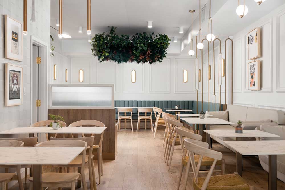
7 Mar 2023
Great design is part of the mezze at this middle eastern restaurant
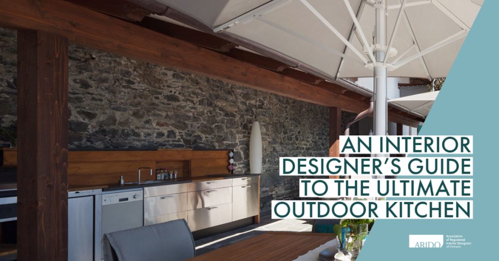
4 Jul 2022
An Interior Designer’s Guide To The Ultimate Outdoor Kitchen
17 Jan 2022
The materials palette is as lush as the menu at this Toronto restaurant
14 Jan 2022
Student Housing is reinvented at this former hotel
7 Jan 2022
A client’s forever home reflects their interesting lives in a one of a kind space