Skip to main content
Search
Find a Pro
Login
Our Purpose
Who We Are
About Interior Design
Our Board
Contact Us
Meet Our Pros
Directory
Report Misuse
Interior Designer Defined
Standards & Enforcement
File A Complaint
Report An Illegal Interior Designer
Become an Interior Designer
Credentials Matter
Pathway to Interior Design
Join ARIDO
Reinstatement of Membership
ROI
About ROI
Past ROI Initiatives
Sponsorship Opportunity
Application
Events
Community Events
2026 ARIDO Awards Gala
2025 ARIDO Awards Gala
2024 ARIDO Awards Gala
ARIDO Townhall and AGM 2026 recap
Ontario Summit and ARIDO AGM 2025 Recap
Ontario Summit & ARIDO AGM ’24 Recap
2026 IDS Toronto Recap
Recap: ARIDO at the Interior Design Show 2025
Industry Opportunities
Event Space Rental
Interior Design Month
Awards
2026 ARIDO Awards Gala
2025 ARIDO Award Winners
2024 ARIDO Awards Winners
Past ARIDO Award Winners
Fellow and Honorary Members
Student Scholarships
Resources
FAQ
RIDA FAQ
News
By-Laws
Partnerships
Equity, Diversity, & Accessibility
CEU Opportunities
Job Opportunities
Submit Your Job Post
Virtual Suggestion Box
For Members
Membership Gateway
ARIDOAccess
Professional Development
Submit Your Job Post
Student Opportunities
Insurance Options
Blog
Login
Search
This field is required
All
Blog
News
2 Feb 2023
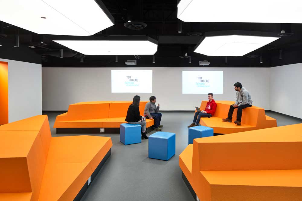
This classroom design projects the future
12 Jan 2023
ARIDO Award: Ontario Institute for Studies in Education Lobby and Entrance
28 Nov 2022
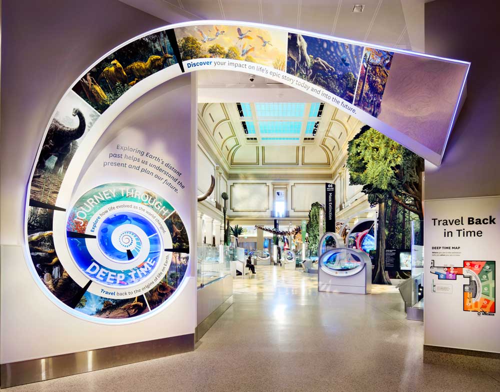
ARIDO Award: Deep Time Hall at the National Museum of Natural History
20 Jun 2022
A lesson in bringing history and innovation together
10 Jan 2022
Interior Designers sequenced someone’s DNA for this vibrant lobby design
Previous page
Page
1
Page
2